The 2016 Pantone Color of the Year Is...
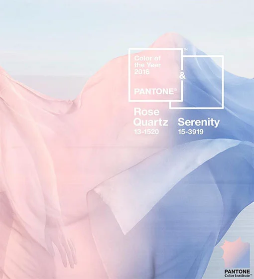
See ya later, Marsala! Pantone just declared not one, but two colors of the year for 2016: Rose Quartz and Serenity. But don't call them baby pink and baby blue, the Pantone Color Institute executive director, Leatrice Eiseman, says they're totally different. "Rose Quartz is not baby pink. It doesn't have that wimpy feel."
So why two colors? (It's the first time this has ever been done, by the way.) Eiseman says Rose Quartz and Serenity are often seen together, so it just makes sense to give both of them the coveted title. Also, it's great from a business perspective because it creates opportunities for more color combinations.
And then there's a deeper meaning behind them. The colors provide social commentary on current movements towards gender equality and fluidity. They're also meant to induce feelings of stability, constancy, comfort, relaxation, and balance in today's chaotic world. Eiseman explains that the colors evoke compassion, which a lot of people are after.
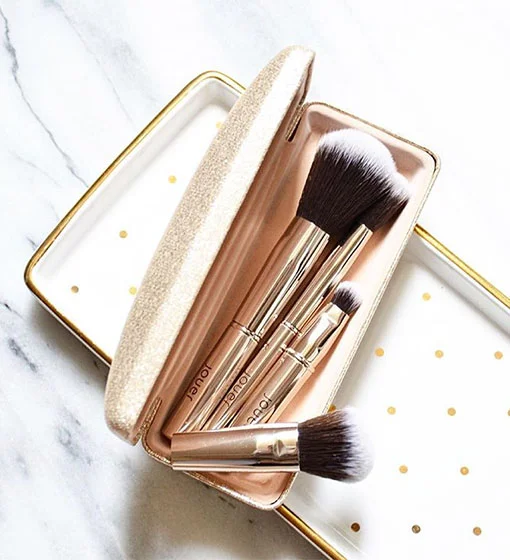
Not to mention, the colors also reflect the growing pastel trend on the runways. In that spirit, we rounded up some beauty products to help you stay on trend.


